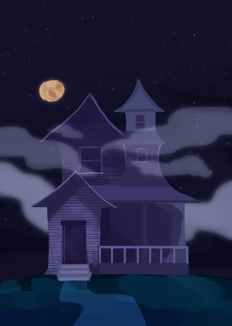
This week I began planning for the intro to my taster. I had my title card ready from the last week, so I moved on to beginning to paint the 2D background that introduce the haunted house the characters will be investigating. This background will only be used for the intro before switching to the 3D environment, which will be the cinema-room style interior.
Intro BG (Work in Progress):

With this background I've taken inspiration from Walt Peregoy and I'm also trying to give the house a sort of 3D-looking quality so that it doesn't clash with the switch to the 3D interior.
An important consideration came up while discussing the target audience during class, and that is the idea that children may try to imitate what they see in a show. I believe with my target audience being towards a tween/teen demographic they would be less likely to feel encouraged to scope out an abandoned house, but I have also taken stylistic decisions with my film to make it a bit more removed from reality. Haunted houses are more of a staple of old American horror, here in Scotland (at least where I'm from) abandoned, scary-looking houses are hard to come by. Many kids in fact grow up in areas like flats or cul-de-sac types, not too rife for exploration. The house's structure too is inspired by environments in cartoons like Scooby Doo, and so the architecture is more exaggerated and not all too representative of the types of homes found in the UK.
